Table of Contents
Usually, every traveler has a love for world projections. I mean, put a world map in front of me, and I can look at it for hours. Come with me and let’s compare the different variants of planispheres and the different projections of a map of the world.
Different world map projections:
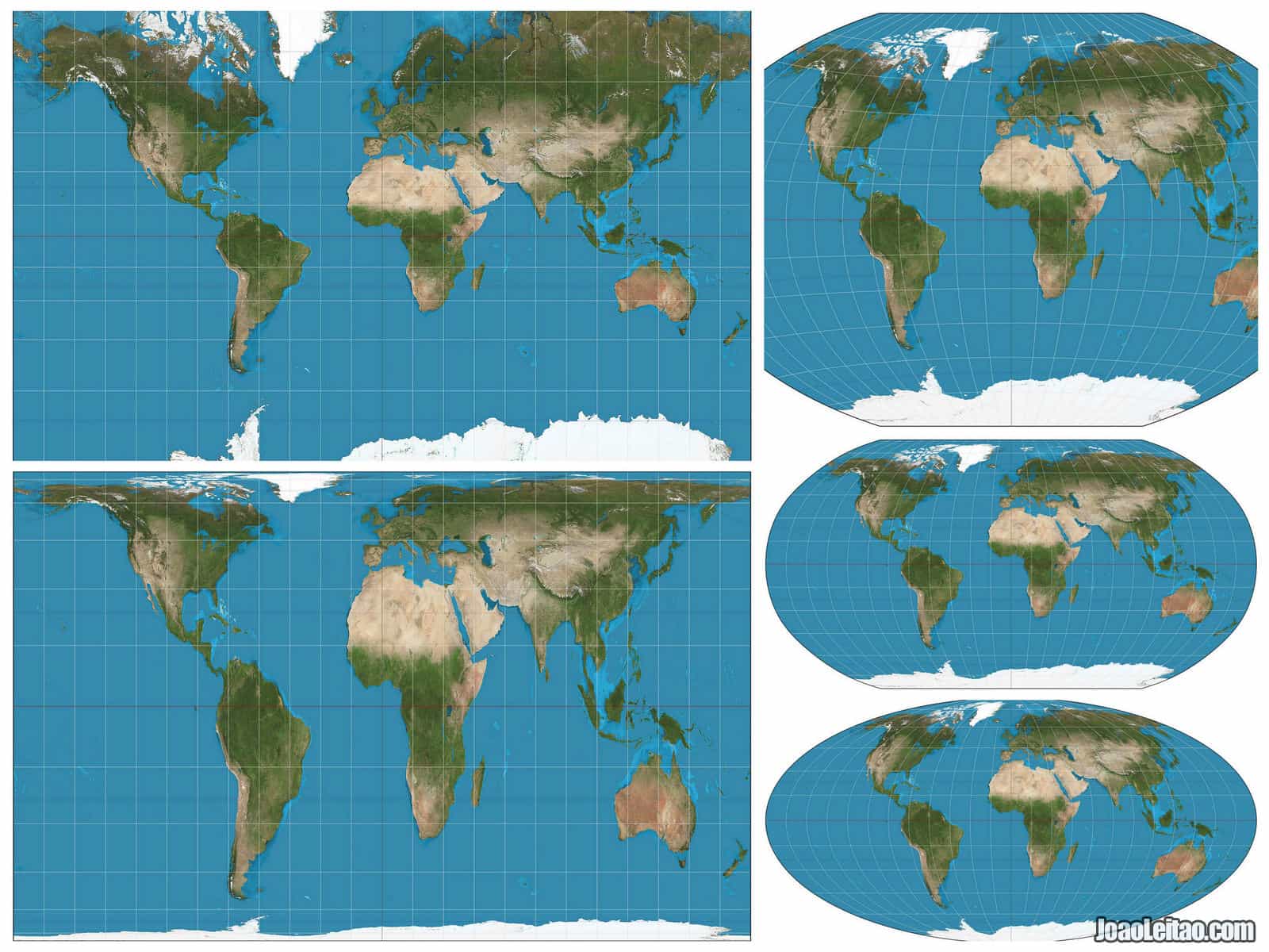
- The Mercator projection
- The Mollweide projection
- The Peters projection
- The Winkel projection
- The Robinson projection
Quick Interesting facts:
- There are more than two hundred different map projections.
- Each projection distorts maps in different ways.
- The projection we are used is commonly known as the Mercator projection.
- What we see in a world map projection is not an accurate representation of the planet.
About world maps in general
The most common world maps are the ones called political maps that show the main cities of each country, usually the capitals, and the borders between each nation.
But sometimes there are different maps combined into one. The physical maps show the planet’s morphology in three dimensions, with information about the relief, above and under the sea, and the soils and vegetation.
Some Planispheres follow a theme, usually connected to a human or natural event, such as the number of people living in an area or levels of pollution, while others represent historical events such as invasions, migrations, or how borders evolved over time.
The Mercator projection was used until today although it dates from the 16th century, and it’s a milestone in the History of cartography. But world maps already existed long before Gerardus Mercator came up with his system.
Before Mercator: Learn more
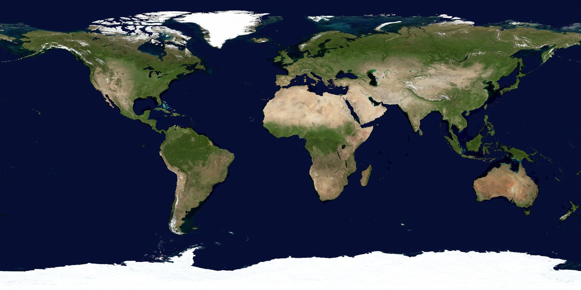
World maps already existed before Gerardus Mercator created his system.
Those were based on the system created by Greek scholar Ptolemy and designed on a grid with latitudes and longitudes. But they focused more on descriptions than accuracy, so it’s dubious that they represented the world as it was then.
Don’t forget that in the Middle Ages many people believed the Earth was flat and that the end of the world was literally on the edges. It didn’t matter if centuries before Ancient Greek scientists had determined the real shape of the planet.
Although Ptolemy’s principles were followed academically, less educated people believed, in fact, the Earth was flat. Can you imagine how terrified the sailors were during the Age of Discoveries? Sailing away in uncharted seas, imagining they would reach the end of the world soon and fall over into oblivion.
Some maps became a classic and part of History, like the fantastic Tabula Rogeriana created by Arab cartographer Muhammad al-Idrisi in 1154 that shows the north in the bottom.
Ebstorf Map, created in the first quarter of the 13th century, was found in a convent in 1843. It’s very similar to another medieval map, the Hereford Mappa Mundi in England. In both maps, Jerusalem is the center of the world and the east is on top. There are notations in the margins of the map with descriptions of the world as they knew it then, including notes about the fauna.
These are just some examples. There are dozens of medieval Mappa Mundi, created before the Mercator Projection. Those include the maps of Psalter (13th century), Theodulf of Orléans (11th century), Isidore of Seville (8th century), and Pietro Vesconte (14th century).

Asia also created some maps of the world as it was known then. The Da Ming Hun Yi Tu was created between the 14th and 15th centuries in China, and its name can be translated into something like “the amalgamated map of the Great Ming Empire.”
China is, of course, in the center and Europe is represented as very tiny and compressed near the border of the planisphere. Africa is represented with the focus on the east coast as seen from India.
The Kangnido map was created in Korea at the beginning of the 15th century, inspired by the cartography techniques of China and sponsored by the Joseon Dynasty. The main focal point of the map is, of course, Korea.
Top 5 different world map projections
Let’s start with our comparison between the maps.
1. The Mercator Projection
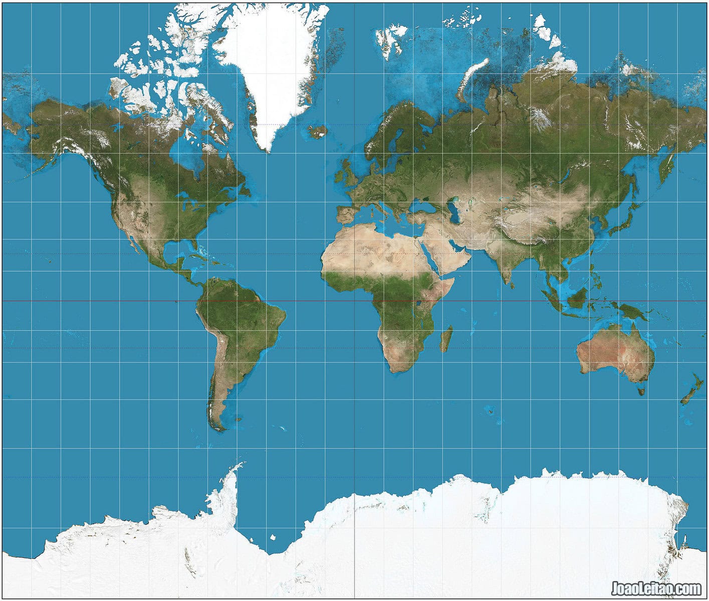
From all the world map projections, this is the one most of us are used to see. It was created by Gerardus Mercator, a cartographer and maker of globes from Flanders who lived in the 16th century. And let’s take advantage of the fact that it’s familiar to us as a tool to showcase how the need to show the Earth on a flat surface can misrepresent it.
In the Mercator Projection, Greenland is as big as Africa, and Alaska looks bigger than Brazil. But what if I told you that Mexico is more or less the size of Greenland and Alaska is about one fifth the size of Brazil?
Yes, the famous world map we used to study from is flawed.
The classic planisphere based on the Mercator Projection places Europe in the center. In cartography, that’s called Eurocentrism, a trend that remained almost intact until the present time. But it’s understandable. After all, Europe was the home of Gerardus Mercator and most of his clients were European.
Although it became natural for us to use this map in our daily lives, initially those maps based on the Mercator Projection were meant to be used at sea.
Mercator is used for navigation or maps of equatorial regions. Any straight line between two points is a true line of constant direction, but not usually the shortest distance between the two points. Distances are true only along the equator but are reasonably correct within 15° either side. Areas and shapes of large areas are distorted. Distortion increases away from the equator and is extreme in polar regions (Greenland appears larger than Africa but is actually 14 times smaller). Parallels and meridians are straight lines which meet at right angles. Meridians are equally spaced but parallels are stretched towards the poles. Poles are not shown.
World maps by The Guardian
2. The Mollweide Projection
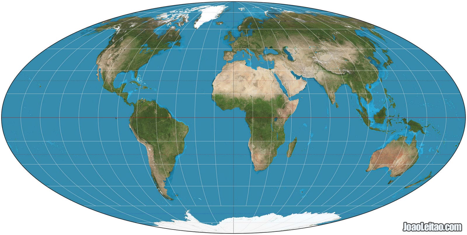
This projection was created by German mathematician and astronomer Karl Brandan Mollweide and published for the first time in 1805. It became popular again in 1850 thanks to the work of Jacques Babinet who called it Homolographic Projection.
It’s a pseudo-cylindric projection with an equator line and a perpendicular meridian half its size. Parallels are straight lines that compress as they get closer to the poles, while meridians are shown as curved lines.
Although it’s represented in a planisphere as an ellipse, the central areas are precise, but the side areas are distorted.
This projection sacrifices the precision of some of the angles and shapes, in exchange for a better representation of the planet’s proportions when that is an important consideration.
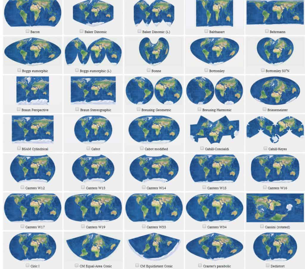
Other lesser-known models were created based on the Mollweide Projection, such as the Van der Grinten Projection or the Boggs Euromorphic Projection.
3. The Peters Projection
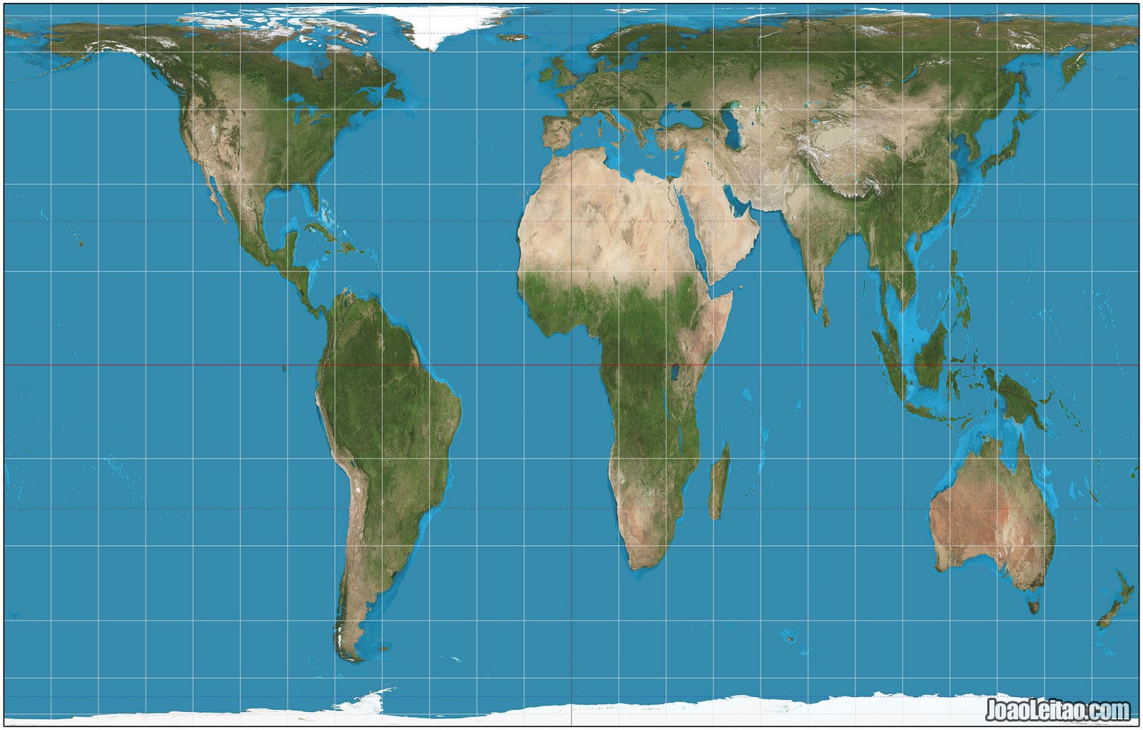
The Arno Peters Projection is recent, from 1973, but inspired by the Gall Projection from the 19th century.
Some say that because Arno Peters worked at a time when worldwide decolonization was coming to an end, he tried to reset the cartographic representation of the world by taking away the importance of the western world in the maps designed so far according to Mercator Projection. The result was extreme and overcompensated the significance of the southern hemisphere.
Maps based on the Peters Projection are widely used in English-speaking schools and by UNESCO.
4. The Winkel Tripel Projection
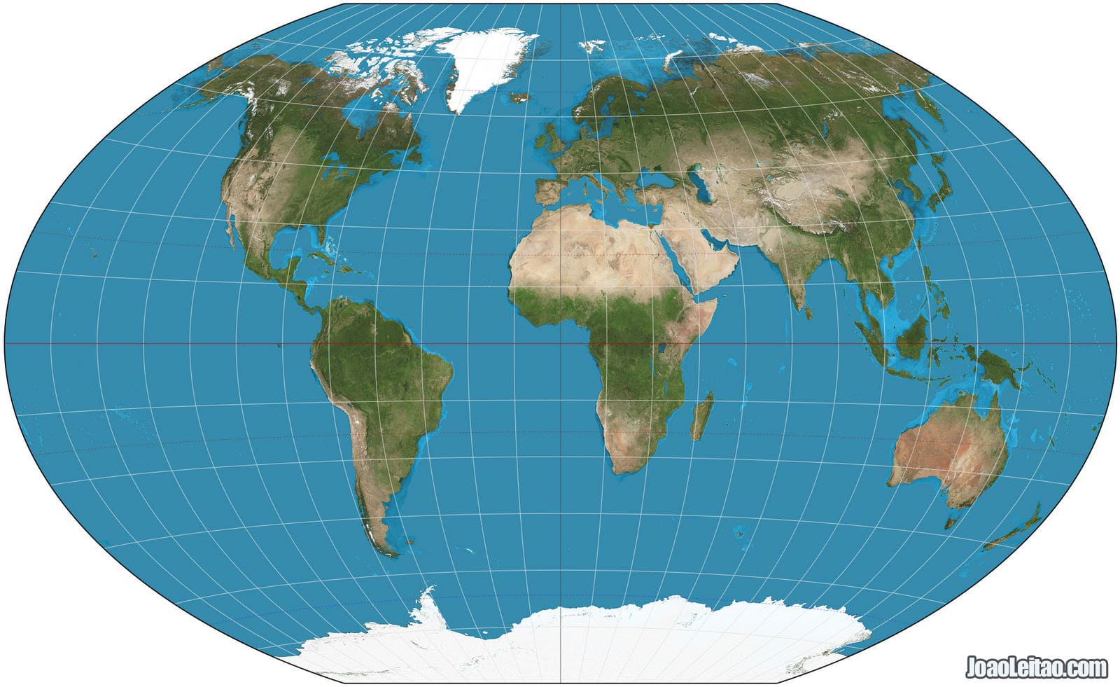
Created in 1921 by German cartographer Oswald Winkle it’s called “tripel” (the German word for triple) because Winkel tried to minimize the distortions threefold, in area, distance, and direction.
This method was used by the National Geographic Society in the US in 1998, replacing the previous maps based on the Robinson Projection. Since then, many schools and textbooks have adopted the Winkel Tripel Projection.
4. The Robinson Projection
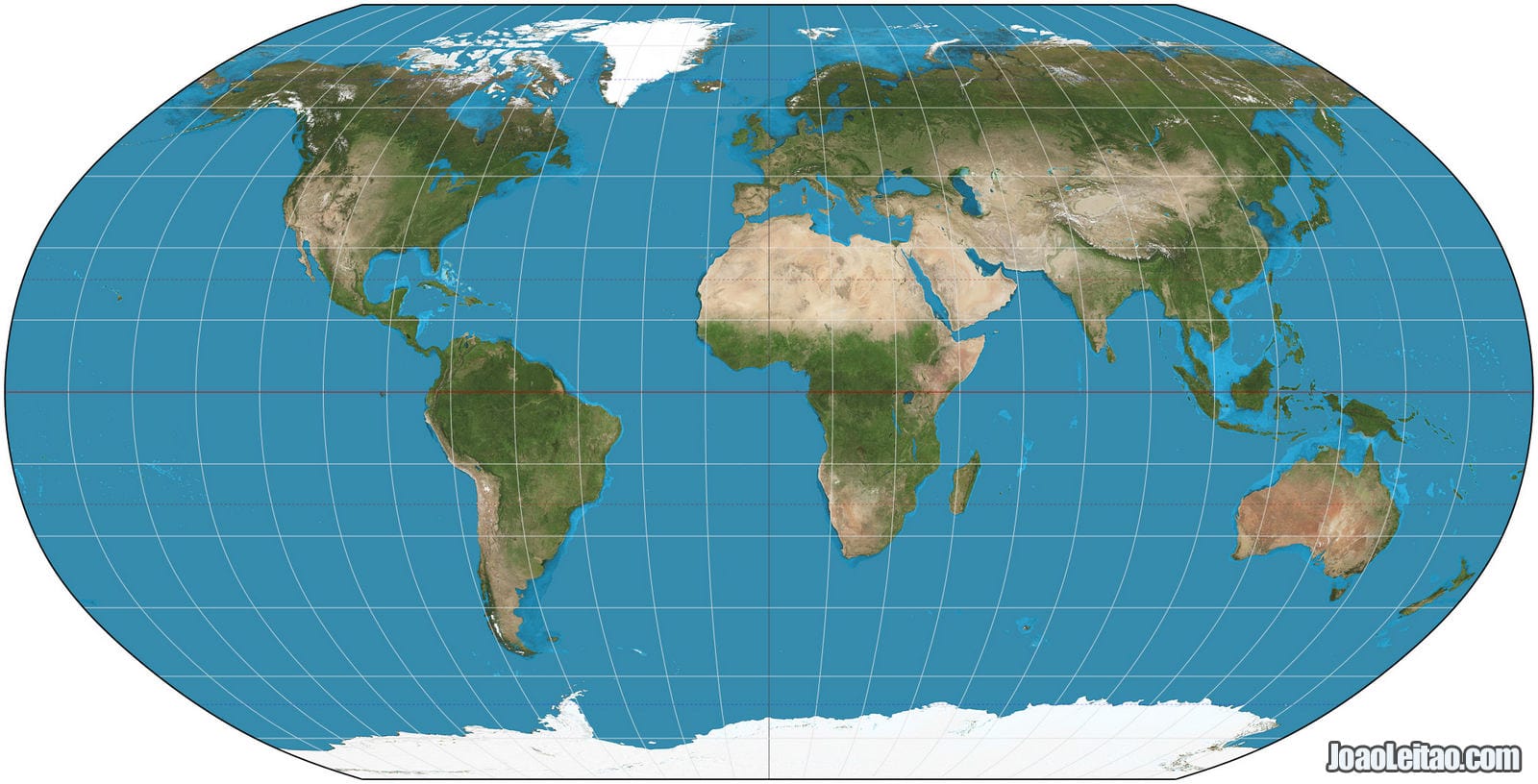
In 1963, the American geographer Arthur G. Robinson introduced an alternative projection system that, unlike what was normal until then, wasn’t based on the transposition of points by mathematical equations but by a system of tables.
Although his model represented the continents more accurately than the Mercator Projection, the poles are highly distorted.
For ten years, from 1988 to 1998, the National Geographic Society in the US used this projection. Before that, they had used the Van der Grintem Projection and, after that, the Winkel Tripel Projection.
Other Projections

I mentioned the main projections used since the Middle Ages to represent the Earth on maps, but many more projections were created throughout the years, although none of them as popular or as widely used as the ones I listed above.
The search for the perfect map has kept cartographers and mathematicians all over the world busy, which resulted in many more projections. Those include the Cassini Projection (1745), the Gauss-Kruger Projection (1822), the Miller Projection (1942), the Behrman Projection (1910), the Hobo-Dyer Projection (2002), and the Collignon Projection (1865).
Those are just some of the dozens of projections out there so you can grasp the diversity of creations in this field. Some are older concepts perfected, while others are built upon older versions of themselves, such as Eckert II, IV and VI.
The Different Centers of the Planispheres
Let’s not talk about different map projections for a moment and focus on how the representation of Earth on a planisphere can change based on what is chosen as the center.
For example, when we think of a world map, we visualize a representation based on the Mercator Projection with Europe in the center. It’s only natural because Mercator defined how maps were made for over 500 years and he was European. His perspective was the only one for many years.
However, you can change the center of a planisphere and that’s been used as a weapon by nationalist movements or to sustain some scientific theories, especially in the field of geopolitics.
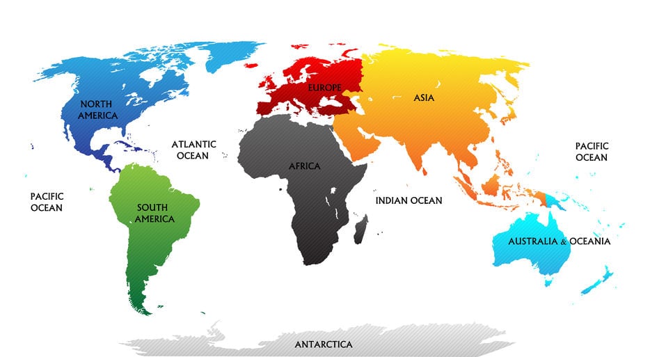
Map with all the seven continents: Africa, Asia, Pacific, North America, South America, Oceania and Antarctica
Mercator’s Eurocentrism can easily be replaced and, for example, maps in the USA show a different planet Earth where Europe fades to the side, about where we’d picture India in a planisphere. In Japan, planispheres place the land of the rising sun top and center.
These are refreshing variations that show us different graphic perspectives of our planet that we aren’t used to and helps us see details we had never noticed before.
For example, the closeness between Russia and the USA, only 80 km from each other, separated by the Bearing Strait that separates Alaska from the Russian area of Chukotka.
Or the flight routes that seem absurd to those who are used to Mercator’s Eurocentrism but that makes perfect sense for those who see the planet as a globe.
Planisphere Variants
The most common world maps are the ones called political maps that show the main cities of each country, usually the capitals, and the borders between each nation. But sometimes there are different maps combined into one.
The physical maps show the planet’s morphology in three dimensions, with information about the relief, above and under the sea, and the soils and vegetation.
Some Planispheres follow a theme, usually connected to a human or natural event, such as the number of people living in an area or levels of pollution while others represent historical events such as invasions, migrations, or how borders evolved.
Elements of a Planisphere
A good planisphere has a series of elements to describe its characteristics. Some are optional, but others are essential and almost mandatory.
All planispheres must have a scale, but distortion will make this element less precise. Although in a planisphere direction is obvious, we all know which side is north, this element is also mandatory. The legend has essential information that explains the colors and symbols used on the map.
Most maps have a title, the projection method and, especially in older planispheres, the name of the cartographer who designed it and the date.
What about the Internet?
- The cartographic tool most used online, and even offline for some time now, is Google Maps. Despite all its tools and possibilities, Google Maps uses an adapted Mercator Projection, and so does Bing Maps, Yahoo Maps, OpenStreetMap, and MapQuest.
- But the Internet brought us something else, a great tool that allows us to see the planet in two dimensions without distortion: Google Earth. With this system, the user can spin the globe, zoom in to the points they want to see closer, and although it’s not technically a map because it’s a series of grouped satellite photos, it provides a correct visual perception of the world where scales, angles, and shapes are preserved.
- Check out this interesting website to compare map projections.
Wrapping Up
What have we learned from all these different world map projections?
- That what we see in a world map projection is not an accurate representation of the planet, and it couldn’t be because it’s impossible to represent a globe in two dimensions.
- The Earth is not flat, as some of the scholars of Ancient Greece had mentioned before. And because it’s not flat, any attempt to represent it on a map will somewhat fail.
- Over the centuries, mathematicians and cartographers tried to define the best method to minimize distortion that comes from creating a planisphere, but the best solution is still not consensual.
- If you want to have a real perception of what our planet is like without distortions and with the correct proportions, it’s better to use a globe. That is an accurate model of Earth.
- It’s true that even those follow a specific pattern, with the North Pole at the top and the South Pole at the bottom, but it’s still a more accurate tool than a planisphere.
Also read my page:


